
Branding
Tū Ora – the Health and Performance Team behind the world’s most iconic rugby team, the All Blacks had a bold vision:
They wanted a strong, meaningful identity that reflected their commitment to nurturing each individual player to their fullest potential, while honouring the strength and mana of the team.


The brief was clear: create a brand deeply rooted in New Zealand identity, celebrating Māori heritage, and embodying focus, pride, and performance.
It needed to feel sharp, modern, and powerful, fitting for a team whose work fuels the most dominant, healthy, powerful, fast, rugby players in the world.

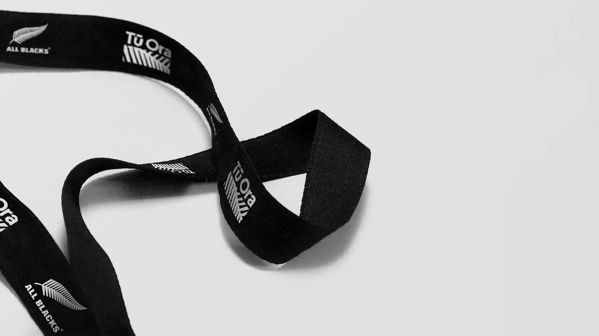
We developed a visual identity centred on a hyper-focused view of the silver fern, an iconic symbol recognised across Aotearoa and the world. This close-up perspective symbolises Tū Ora’s mission: nurturing the individual while strengthening the team. The logo captures focus and guidance, echoing Tū Ora’s critical role in preparing All Blacks athletes for world-leading performance. The name “Tū Ora” draws proudly from Māori heritage, encapsulating strength, vitality, and the relentless pursuit of excellence. The design is streamlined, confident, and powerful – projecting clarity, precision, and movement. Supporting the visual identity, we built a brand style that reflects Tū Ora’s high standards of unity, communication, adaptability, and energy, aligning seamlessly with the culture of excellence that underpins the All Blacks’ global success.


“Naked Creative captured the spirit of Tū Ora perfectly.
This work isn't just a logo – it’s a powerful symbol of who we are, what we stand for, and the path we create for every player we work with.
It reflects our pride, our focus, and our commitment to leading the world in health and performance.”